Typography
Our words define who we are, and so does our typography.
When used appropriately, typography can add visual meaning to our words. Our primary typeface – Museo Sans – is recommended for nearly all of our materials. It expresses the university’s brand personalities as welcoming and inclusive, yet bold and confident; collegial with a California spirit; and aspirational, yet open and inviting. Our secondary serif font – Kepler – is for formal and academic purposes.
Both fonts have breadth of styles allowing us a wider selection of typographic options tailored for each piece while instilling brand recognition.
![]()
Typefaces for Print and Web
Our primary typeface, Museo Sans, comes in several styles. We use it for everything from headlines to body copy. For print and web, Museo Sans is readily available as part of campuswide Adobe Creative licensing: fonts.adobe.com. Use your campus credentials to log in to access fonts.
Used Fonts
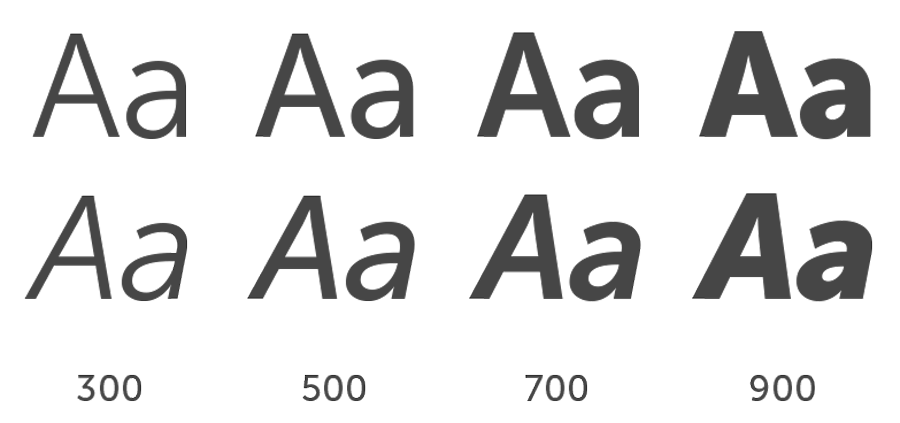
Museo Sans
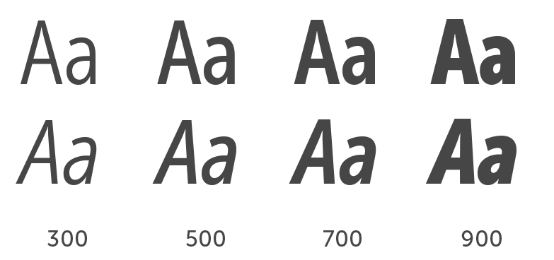
Museo Sans Condensed
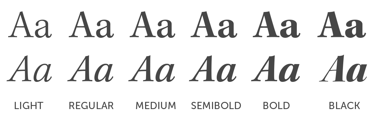
Kepler
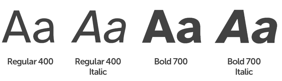
Atkinson Hyperlegible
Recommended by the Braille Institute, Atkinson Hyperlegible font is designed for greater legibility and readability for low vision readers. It can be used as an alternative font for difficult-to-read applications such as instructional materials, research posters, videos, small applications, etc.
Download Atkinson Hyperlegible Font